Forms
Fieldset
Group related form controls with legends, descriptions, and actions
Import
import { Fieldset } from '@blakeui/react';Usage
"use client";

import {
  Button,
Description,In Surface
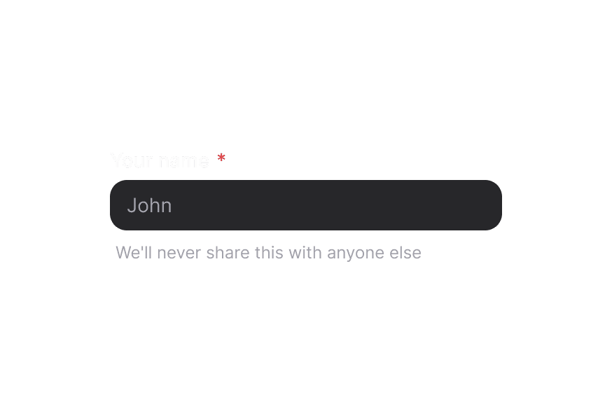
When used inside a Surface component, use variant="secondary" on form controls (Input, TextArea, etc.) to apply the lower emphasis variant suitable for surface backgrounds.
"use client";

import {
  Button,
Description,Anatomy
Import the Fieldset component and access all parts using dot notation.
import { Fieldset } from '@blakeui/react';

export default () => (
  <Fieldset>
    <Fieldset.Legend />
    <Fieldset.Group>
      {/* form fields go here */}
    </Fieldset.Group>
    <Fieldset.Actions>
      {/* action buttons go here */}
    </Fieldset.Actions>
  </Fieldset>
)
Styling
Passing Tailwind CSS classes
import { Fieldset, TextField, Label, Input } from '@blakeui/react';

function CustomFieldset() {
  return (
    <Fieldset className="rounded-xl border border-border bg-surface p-6 shadow-sm">
      <Fieldset.Legend className="text-lg font-semibold">Team members</Fieldset.Legend>
      <Fieldset.Group className="grid gap-4 md:grid-cols-2">
        <TextField>
          <Label>First name</Label>
          <Input className="rounded-full border-border/60" placeholder="Jane" />
        </TextField>
        <TextField>
          <Label>Last name</Label>
          <Input className="rounded-full border-border/60" placeholder="Doe" />
        </TextField>
      </Fieldset.Group>
      <Fieldset.Actions className="justify-end gap-3">
        {/* Action buttons */}
      </Fieldset.Actions>
    </Fieldset>
  );
}
Customizing the component classes
Use the @layer components directive to target Fieldset BEM-style classes.
A worked example is in Styling.
CSS Classes
The Fieldset compound component exposes these CSS selectors:
.fieldset– Root container.fieldset__legend– Legend element.fieldset__field_group– Wrapper for grouped fields.fieldset__actions– Action bar below the fields
API Reference
Fieldset Props
| Prop | Type | Default | Description |
|---|---|---|---|
className | string | - | Tailwind CSS classes applied to the root element. |
children | React.ReactNode | - | Fieldset content (legend, groups, descriptions, actions). |
nativeProps | React.HTMLAttributes<HTMLFieldSetElement> | Supports native fieldset attributes and events. |
Fieldset.Legend Props
| Prop | Type | Default | Description |
|---|---|---|---|
className | string | - | Tailwind classes for the legend element. |
children | React.ReactNode | - | Legend content, usually plain text. |
nativeProps | React.HTMLAttributes<HTMLLegendElement> | - | Native legend attributes. |
Fieldset.Group Props
| Prop | Type | Default | Description |
|---|---|---|---|
className | string | - | Layout and spacing classes for grouped fields. |
children | React.ReactNode | - | Form controls to group inside the fieldset. |
nativeProps | React.HTMLAttributes<HTMLDivElement> | - | Native div attributes. |
Fieldset.Actions Props
| Prop | Type | Default | Description |
|---|---|---|---|
className | string | - | Tailwind classes to align action buttons or text. |
children | React.ReactNode | - | Action buttons or helper text. |
nativeProps | React.HTMLAttributes<HTMLDivElement> | - | Native div attributes. |