Forms
Label
Renders an accessible label associated with form controls
Import
import { Label } from '@blakeui/react';Usage
import {Input, Label} from "@blakeui/react";

export function Basic() {
  return (
    <div className="flex flex-col gap-1">
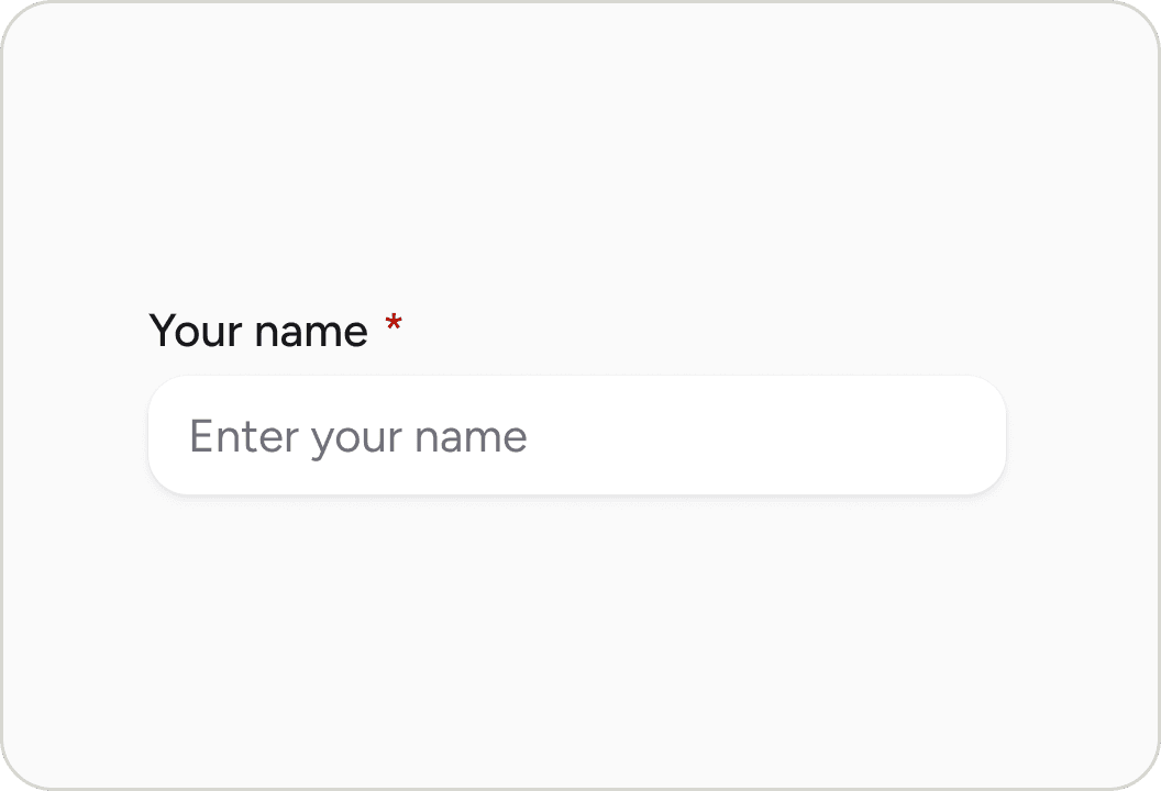
      <Label htmlFor="name">Name</Label>
      <Input className="w-64" id="name" placeholder="Enter your name" type="text" />
    </div>
  );
}API
Label Props
| Prop | Type | Default | Description |
|---|---|---|---|
htmlFor | string | - | The id of the element the label is associated with |
isRequired | boolean | false | Whether to display a required indicator |
isDisabled | boolean | false | Whether the label is in a disabled state |
isInvalid | boolean | false | Whether the label is in an invalid state |
className | string | - | Additional CSS classes |
children | ReactNode | - | The content of the label |
Accessibility
The Label component is built on the native HTML <label> element (MDN Reference) and follows WAI-ARIA best practices:
- Associates with form controls using the
htmlForattribute - Provides semantic HTML
<label>element - Supports keyboard navigation when associated with form controls
- Communicates required and invalid states to screen readers
- Clicking the label focuses/activates the associated form control
Styling
CSS Classes
The Label component uses these CSS classes (View source styles):
Base Classes
.label- Base label styles with text styling
State Modifier Classes
.label--requiredor[data-required="true"] > .label- Shows required asterisk indicator.label--disabledor[data-disabled="true"] .label- Disabled state styling.label--invalidor[data-invalid="true"] .labelor[aria-invalid="true"] .label- Invalid state styling (danger/red text color)
Note: The required asterisk is smartly applied using role and data-slot detection. It excludes:
- Elements with
role="group",role="radiogroup", orrole="checkboxgroup" - Elements with
data-slot="radio"ordata-slot="checkbox"
This prevents duplicate asterisks when using group components with required fields.
Examples
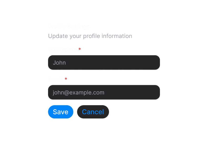
With Required Indicator
<Label htmlFor="email" isRequired>
  Email Address
</Label>
<Input id="email" type="email" />
With Disabled State
<Label htmlFor="username" isDisabled>
  Username
</Label>
<Input id="username" isDisabled />
With Invalid State
<Label htmlFor="password" isInvalid>
  Password
</Label>
<Input id="password" isInvalid />