ColorPicker
A composable color picker that synchronizes color value between multiple color components
Import
import {
  ColorPicker,
  ColorArea,
  ColorSlider,
  ColorSwatch,
  ColorField,
  ColorSwatchPicker,
} from '@blakeui/react';
Usage
import {ColorArea, ColorPicker, ColorSlider, ColorSwatch, Label} from "@blakeui/react";

export function Basic() {
  return (
<ColorPicker defaultValue="#0485F7">Anatomy
The ColorPicker is a composable component that combines multiple color components:
import { ColorPicker, ColorArea, ColorSlider, ColorSwatch, Label } from '@blakeui/react';

export default () => (
  <ColorPicker defaultValue="#0485F7">
    <ColorPicker.Trigger>
      <ColorSwatch />
      <Label>Pick a color</Label>
    </ColorPicker.Trigger>
    <ColorPicker.Popover>
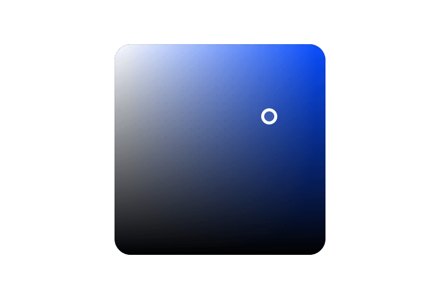
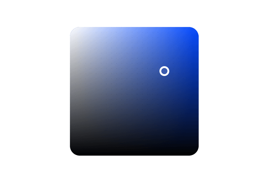
      <ColorArea colorSpace="hsb" xChannel="saturation" yChannel="brightness">
        <ColorArea.Thumb />
      </ColorArea>
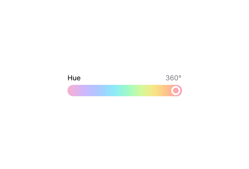
      <ColorSlider channel="hue" colorSpace="hsb">
        <ColorSlider.Track>
          <ColorSlider.Thumb />
        </ColorSlider.Track>
      </ColorSlider>
    </ColorPicker.Popover>
  </ColorPicker>
);
Controlled
Selected: #325578
"use client";

import {
  Button,
ColorArea,With Swatches
import {
  ColorArea,
  ColorPicker,
  ColorSlider,
ColorSwatch,With Fields
Use ColorField to allow users to edit individual color channel values with a Select to switch between color spaces.
"use client";

import type {ColorChannel, ColorSpace} from "@blakeui/react";

import {With Sliders
Use multiple ColorSlider components to adjust each channel of a color value.
"use client";

import type {ColorChannel, ColorSpace} from "@blakeui/react";

import {ColorPicker, ColorSlider, ColorSwatch, Label, ListBox, Select} from "@blakeui/react";Styling
Passing Tailwind CSS classes
import { ColorPicker, ColorArea, ColorSlider, ColorSwatch, Label } from '@blakeui/react';

function CustomColorPicker() {
  return (
    <ColorPicker defaultValue="#0485F7">
      <ColorPicker.Trigger className="gap-4">
        <ColorSwatch className="rounded-lg" />
        <Label>Pick a color</Label>
      </ColorPicker.Trigger>
      <ColorPicker.Popover className="p-4 rounded-xl">
        <ColorArea colorSpace="hsb" xChannel="saturation" yChannel="brightness">
          <ColorArea.Thumb />
        </ColorArea>
      </ColorPicker.Popover>
    </ColorPicker>
  );
}
Customizing the component classes
To customize the ColorPicker component classes, you can use the @layer components directive.
Learn more.
A worked example is in Styling.
blakeUI follows the BEM methodology to ensure component variants and states are reusable and easy to customize.
CSS Classes
The ColorPicker component uses these CSS classes (View source styles):
Base Classes
.color-picker- Base container.color-picker__trigger- Trigger button.color-picker__popover- Popover container
Interactive States
The component supports both CSS pseudo-classes and data attributes for flexibility:
- Focus:
:focus-visibleor[data-focus-visible="true"] - Disabled:
:disabledor[data-disabled="true"]
API Reference
ColorPicker Props
Inherits from React Aria ColorPicker.
| Prop | Type | Default | Description |
|---|---|---|---|
value | string | Color | - | The current color value (controlled) |
defaultValue | string | Color | - | The default color value (uncontrolled) |
onChange | (color: Color) => void | - | Handler called when the color changes |
children | React.ReactNode | - | Content of the color picker (Trigger, Popover, etc.) |
className | string | - | Additional CSS classes |
ColorPicker.Trigger Props
| Prop | Type | Default | Description |
|---|---|---|---|
children | React.ReactNode | ((renderProps) => React.ReactNode) | - | Trigger content or render prop |
className | string | - | Additional CSS classes |
ColorPicker.Popover Props
| Prop | Type | Default | Description |
|---|---|---|---|
placement | Placement | "bottom left" | Placement of the popover |
children | React.ReactNode | - | Popover content |
className | string | - | Additional CSS classes |
Related Types
Color
Represents a color value. See React Aria Color for full API.
| Method | Description |
|---|---|
toString(format) | Converts the color to a string in the given format (hex, rgb, hsl, hsb, css) |
toFormat(format) | Converts the color to the given format and returns a new Color object |
getChannelValue(channel) | Returns the numeric value for a given channel |
withChannelValue(channel, value) | Sets the numeric value for a channel and returns a new Color |
parseColor
import { parseColor } from 'react-aria-components';

// Parse from string
const color = parseColor('#ff0000');
const hslColor = parseColor('hsl(0, 100%, 50%)');