Surface
Container component that provides surface-level styling and context for child components
Import
import { Surface } from '@blakeui/react';Usage
Default
Surface Content
This is a default surface variant. It uses bg-surface styling.
Secondary
Surface Content
This is a secondary surface variant. It uses bg-surface-secondary styling.
Tertiary
Surface Content
This is a tertiary surface variant. It uses bg-surface-tertiary styling.
Transparent
Surface Content
This is a transparent surface variant. It has no background, suitable for overlays and cards with custom backgrounds.
import {Surface} from "@blakeui/react";

export function Variants() {
  return (
<div className="flex flex-col gap-4">Overview
The Surface component is a semantic container that provides different levels of visual prominence through variants.
Variants
Surface comes in semantic variants that describe their prominence level:
default- Standard surface appearance (bg-surface)secondary- Medium prominence (bg-surface-secondary)tertiary- Higher prominence (bg-surface-tertiary)
Usage with Form Components
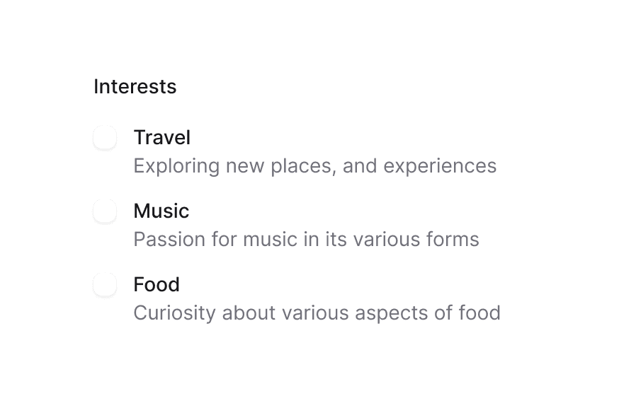
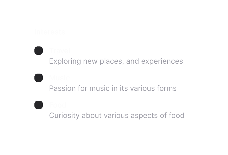
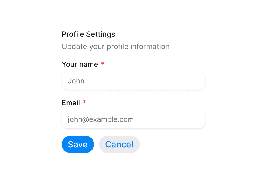
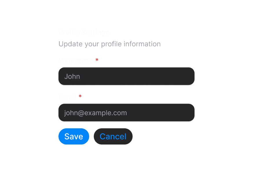
When using form components inside a Surface, use the variant="secondary" prop to apply the lower emphasis variant suitable for surface backgrounds.
import { Surface, Input, TextArea } from '@blakeui/react';

function App() {
  return (
    <Surface variant="default">
      <Input placeholder="Input with secondary variant" variant="secondary" />
      <TextArea placeholder="TextArea with secondary variant" variant="secondary" />
    </Surface>
  );
}
Styling
Passing Tailwind CSS classes
import { Surface } from '@blakeui/react';

function CustomSurface() {
  return (
    <Surface
      className="rounded-2xl p-8 shadow-lg"
      variant="secondary"
    >
      <h2>Custom Styled Surface</h2>
      <p>Content goes here</p>
    </Surface>
  );
}
Customizing the component classes
To customize the Surface component classes, you can use the @layer components directive.
Learn more.
A worked example is in Styling.
blakeUI follows the BEM methodology to ensure component variants and states are reusable and easy to customize.
CSS Classes
The Surface component uses these CSS classes (View source styles):
Base Classes
.surface- Base surface container
Variant Classes
.surface--default- Default surface variant (bg-surface).surface--secondary- Secondary surface variant (bg-surface-secondary).surface--tertiary- Tertiary surface variant (bg-surface-tertiary)
API Reference
Surface Props
| Prop | Type | Default | Description |
|---|---|---|---|
variant | "transparent" | "default" | "secondary" | "tertiary" | "default" | The visual variant of the surface |
className | string | - | Additional CSS classes |
children | ReactNode | - | The surface content |
Context API
SurfaceContext
Child components can access the Surface context to get the current variant:
import { useContext } from 'react';
import { SurfaceContext } from '@blakeui/react';

function MyComponent() {
  const { variant } = useContext(SurfaceContext);
  // variant will be "transparent" | "default" | "secondary" | "tertiary" | undefined
}