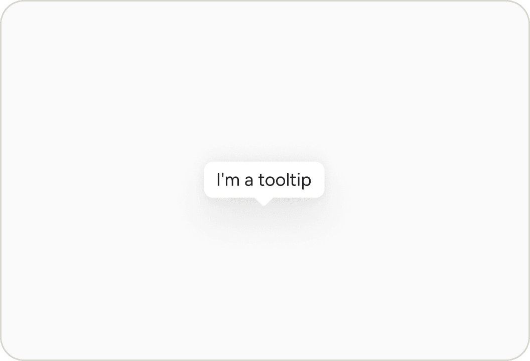
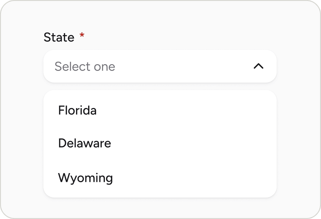
Overlays
Popover
Displays rich content in a portal triggered by a button or any custom element
Import
import { Popover } from '@blakeui/react';Usage
import {Button, Popover} from "@blakeui/react";

export function PopoverBasic() {
  return (
<div className="flex items-center gap-4">Anatomy
Import the Popover component and access all parts using dot notation.
import { Popover } from '@blakeui/react';

export default () => (
  <Popover>
    <Popover.Trigger/>
    <Popover.Content>
      <Popover.Arrow />
      <Popover.Dialog>
        <Popover.Heading/>
        {/* content goes here */}
      </Popover.Dialog>
    </Popover.Content>
  </Popover>
)
With Arrow
import {Button, Popover} from "@blakeui/react";
import {Ellipsis} from "@gravity-ui/icons";

export function PopoverWithArrow() {
return (Placement
Click buttons
import {Button, Popover} from "@blakeui/react";

export function PopoverPlacement() {
  return (
<div className="grid grid-cols-3 gap-4">Interactive Content
SJ
Sarah Johnson
@sarahj
"use client";

import {Avatar, Button, Popover} from "@blakeui/react";
import {useState} from "react";
Custom Render Function
"use client";

import {Button, Popover} from "@blakeui/react";

export function CustomRenderFunction() {Styling
Passing Tailwind CSS classes
import { Popover, Button } from '@blakeui/react';

function CustomPopover() {
  return (
    <Popover>
      <Popover.Trigger>
        <Button>Open</Button>
      </Popover.Trigger>
      <Popover.Content className="bg-accent text-accent-foreground">
        <Popover.Dialog>
          <h3>Custom Styled</h3>
          <p>This popover has custom styling</p>
        </Popover.Dialog>
      </Popover.Content>
    </Popover>
  );
}
Customizing the component classes
To customize the Popover component classes, you can use the @layer components directive.
Learn more.
A worked example is in Styling.
blakeUI follows the BEM methodology to ensure component variants and states are reusable and easy to customize.
CSS Classes
The Popover component uses these CSS classes (View source styles):
Base Classes
.popover- Base popover container styles.popover__dialog- Dialog content wrapper.popover__heading- Heading text styles.popover__trigger- Trigger element styles
Interactive States
The component supports animation states:
- Entering:
[data-entering]- Applied during popover appearance - Exiting:
[data-exiting]- Applied during popover disappearance - Placement:
[data-placement="*"]- Applied based on popover position - Focus:
:focus-visibleor[data-focus-visible="true"]
API Reference
Popover Props
| Prop | Type | Default | Description |
|---|---|---|---|
children | React.ReactNode | - | Trigger and content elements |
isOpen | boolean | - | Controls popover visibility (controlled) |
defaultOpen | boolean | false | Initial open state (uncontrolled) |
onOpenChange | (isOpen: boolean) => void | - | Called when open state changes |
Popover.Content Props
| Prop | Type | Default | Description |
|---|---|---|---|
children | React.ReactNode | - | Content to display in the popover |
placement | "top" | "bottom" | "left" | "right" (and variants) | "bottom" | Placement of the popover |
offset | number | 8 | Distance from the trigger element |
shouldFlip | boolean | true | Whether popover can change orientation to fit |
className | string | - | Additional CSS classes |
render | DOMRenderFunction<keyof React.JSX.IntrinsicElements, PopoverRenderProps> | - | Overrides the default DOM element with a custom render function. |
Popover.Dialog Props
| Prop | Type | Default | Description |
|---|---|---|---|
children | React.ReactNode | - | Dialog content |
className | string | - | Additional CSS classes |
Popover.Trigger Props
| Prop | Type | Default | Description |
|---|---|---|---|
children | React.ReactNode | - | Element that triggers the popover |
className | string | - | Additional CSS classes |
Popover.Arrow Props
| Prop | Type | Default | Description |
|---|---|---|---|
children | React.ReactNode | - | Custom arrow element |
className | string | - | Additional CSS classes |
render | DOMRenderFunction<keyof React.JSX.IntrinsicElements, OverlayArrowRenderProps> | - | Overrides the default DOM element with a custom render function. |