Forms
Description
Provides supplementary text for form fields and other components
Import
import { Description } from '@blakeui/react';Usage
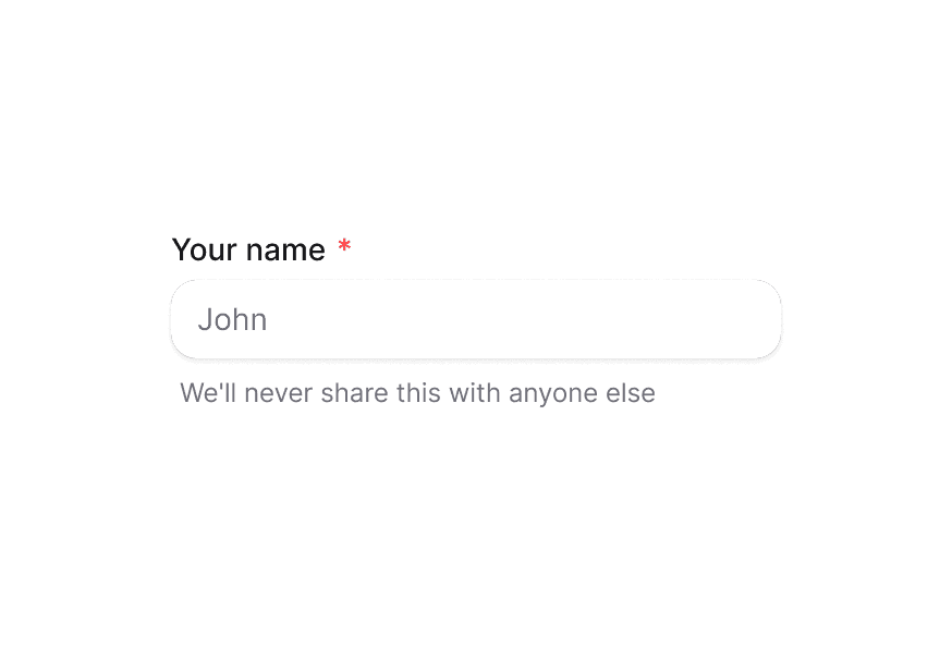
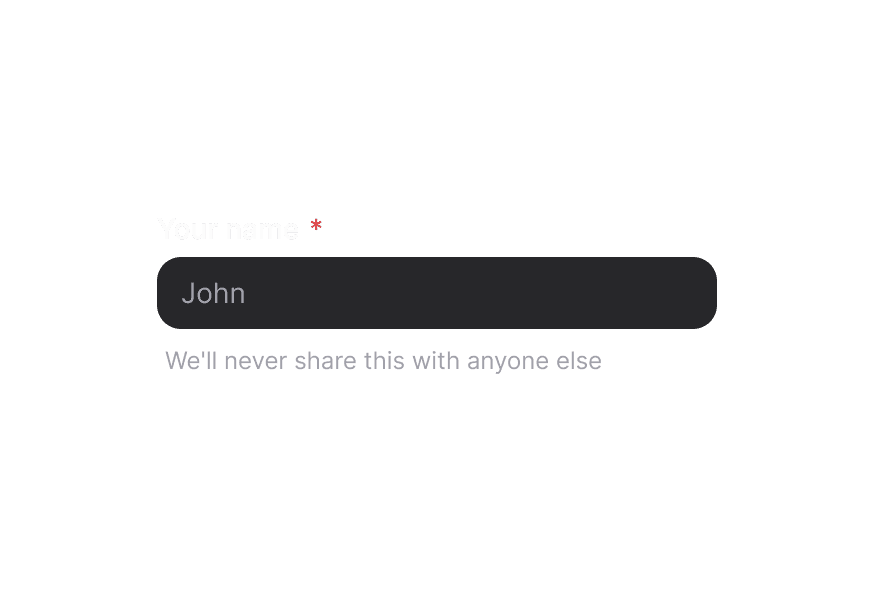
We'll never share your email with anyone else.
import {Description, Input, Label} from "@blakeui/react";

export function Basic() {
  return (
<div className="flex flex-col gap-1">API
Description Props
| Prop | Type | Default | Description |
|---|---|---|---|
className | string | - | Additional CSS classes |
children | ReactNode | - | The content of the description |
Accessibility
The Description component enhances accessibility by:
- Using semantic HTML that screen readers can identify
- Providing the
slot="description"attribute for React Aria integration - Supporting proper text contrast ratios
Styling
The Description component uses the following CSS classes:
.description- Base description styles withmutedtext color
Examples
With Form Fields
<div className="flex flex-col gap-1">
  <Label htmlFor="password">Password</Label>
  <Input id="password" type="password" aria-describedby="password-description" />
  <Description id="password-description">
    Must be at least 8 characters with one uppercase letter
  </Description>
</div>
Integration with TextField
import {TextField, Label, Input, Description} from '@blakeui/react';

<TextField type="email">
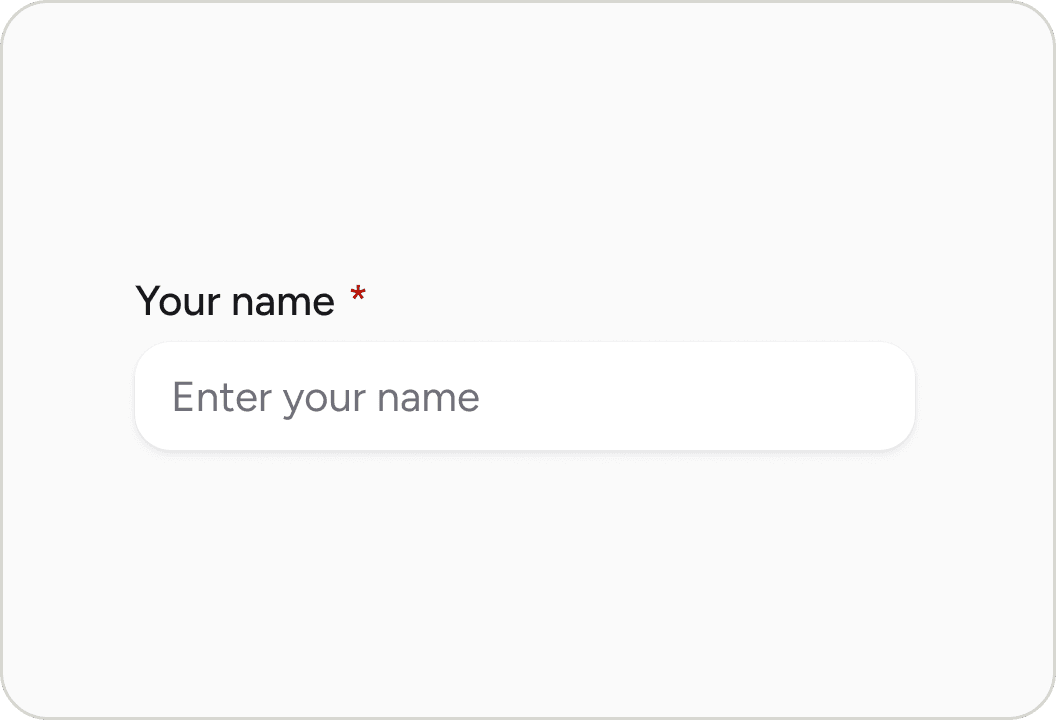
  <Label>Email</Label>
  <Input placeholder="Enter your email" />
  <Description>We'll never share your email</Description>
</TextField>
When using the TextField component, accessibility attributes are automatically applied to the label and description.